
.svg)

A growing consultancy
brought into one system.
Boon Solutions is a Perth-founded systems integrator and specialist data consultancy, helping organisations connect fragmented systems and turn complex information into useful insight.
With Boon Solutions in Australia and Boon Group in Malaysia, the brand needed a shared foundation that could feel connected while keeping each regional entity clear. I refined the existing identity and created practical tools across presentations, social, print, events and a responsive website concept.
A recognised identity
without a shared system.
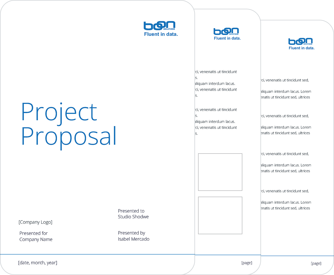
The existing logo and core blue gave Boon a recognisable starting point, but there were no clear rules for colour, typography, logo variations or day-to-day communications. As materials expanded across teams and formats, the opportunity was to create consistency without losing familiarity - and to make the relationship between Boon Solutions and Boon Group easier to understand.
Building one system,
made for everyday use.
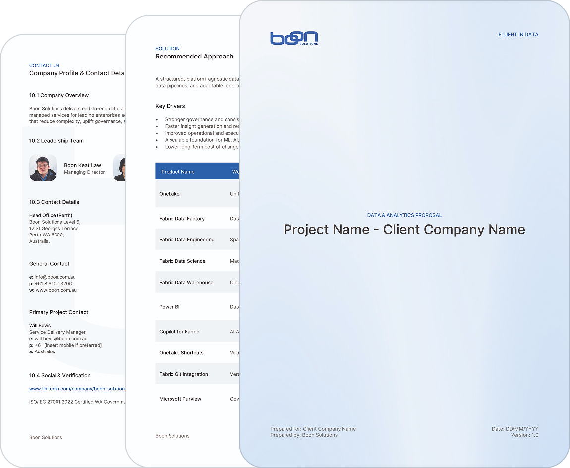
I retained the strongest elements of the identity, refined the wordmark and built a more disciplined system around them. Clear logo variants, colour and typography rules, regional naming guidance and reusable templates gave the team a practical framework for everyday work.
The same principles then shaped a website concept designed to make Boon's services, industries and expertise easier to navigate.
An existing mark,
refined for flexibility.
The original mark carried recognition, so the work focused on precision and flexibility rather than reinvention. I resolved inconsistencies in the lettering, defined primary and secondary lockups for Boon Solutions and Boon Group, and documented the wordmark, logomark, spacing, sizing and colour use.
The guidelines bring these decisions into one practical reference for digital, print and partner materials.


HEX - #FFFFFF
RGB - 255 · 255 · 255
CMYK - 0 · 0 · 0 · 0
HSB - 0° · 0% · 100%
HEX - #F4F6F9
RGB - 244 · 246 · 249
CMYK - 2 · 1 · 0 · 2
HSB - 216° · 2% · 98%

HEX - #2C64E5
RGB - 44 · 100 · 229
CMYK - 81 · 56 · 0 · 10
HSB - 222° · 81% · 90%
HEX - #1E1F21
RGB - 30 · 31 · 33
CMYK - 9 · 6 · 0 · 87
HSB - 220° · 9% · 13%
One clear guide,
for every application.
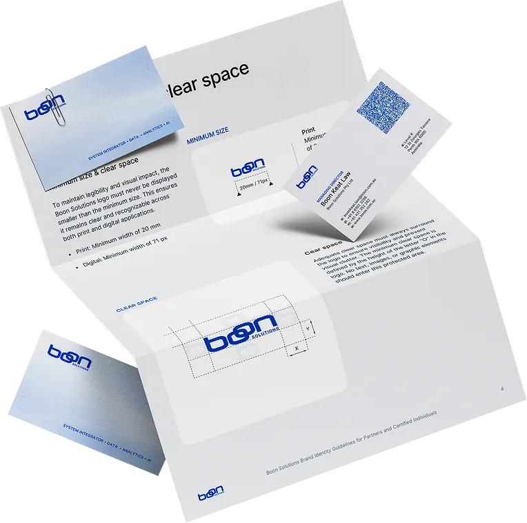
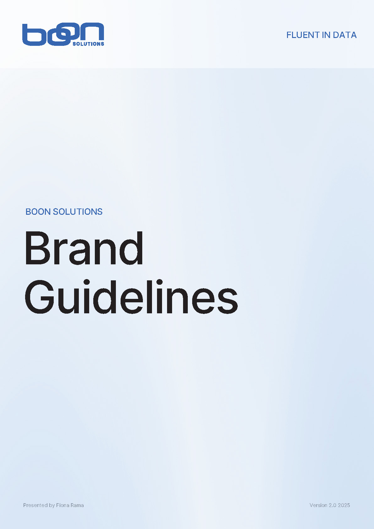
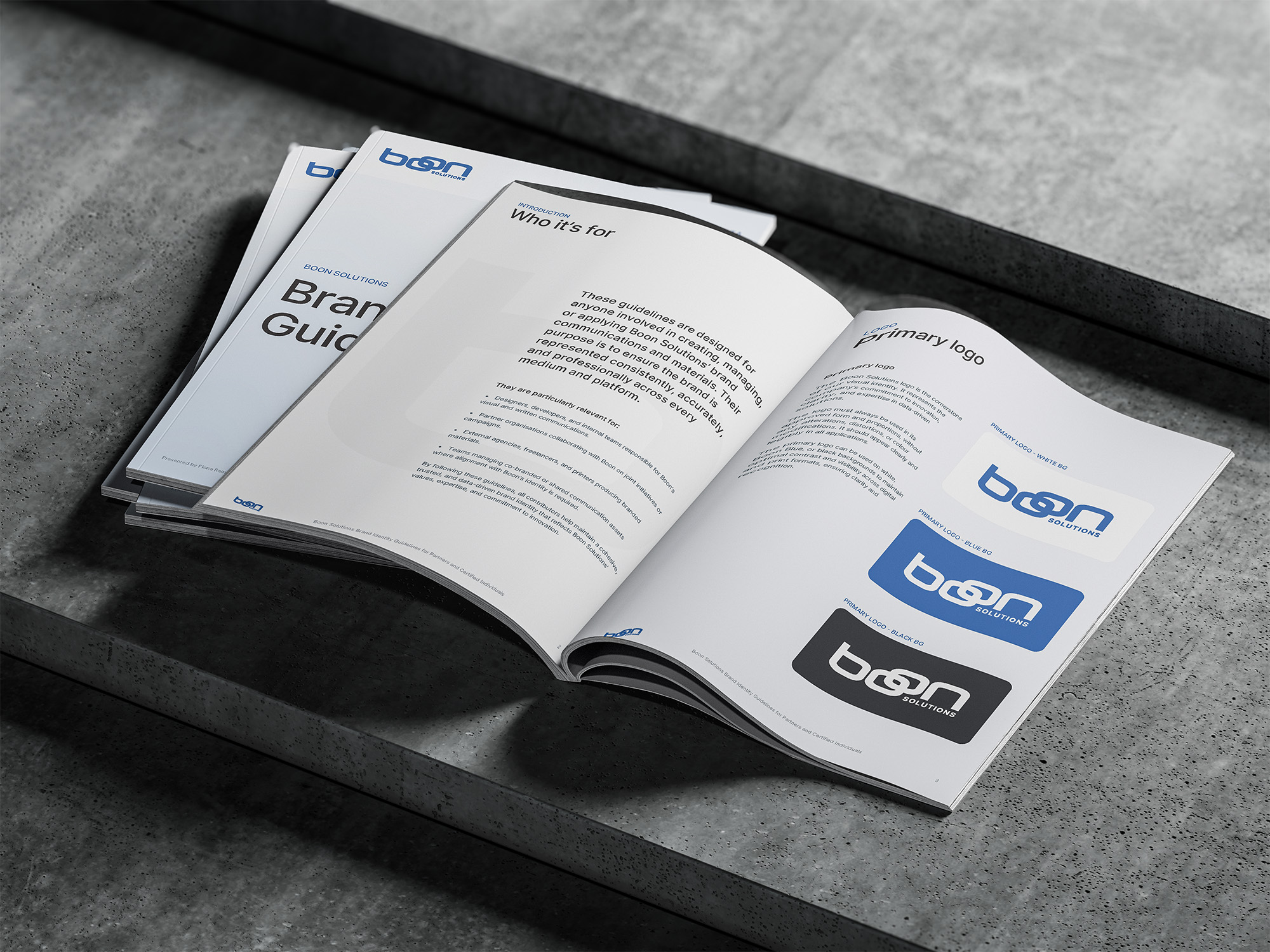
I brought the logo system, colour palette, typography and usage rules into one comprehensive guide. From minimum sizes and clear space to regional lockups and everyday applications, it gives the Boon team a practical reference for keeping the identity consistent across digital, print and partner materials.
A stronger starting point
for every presentation.
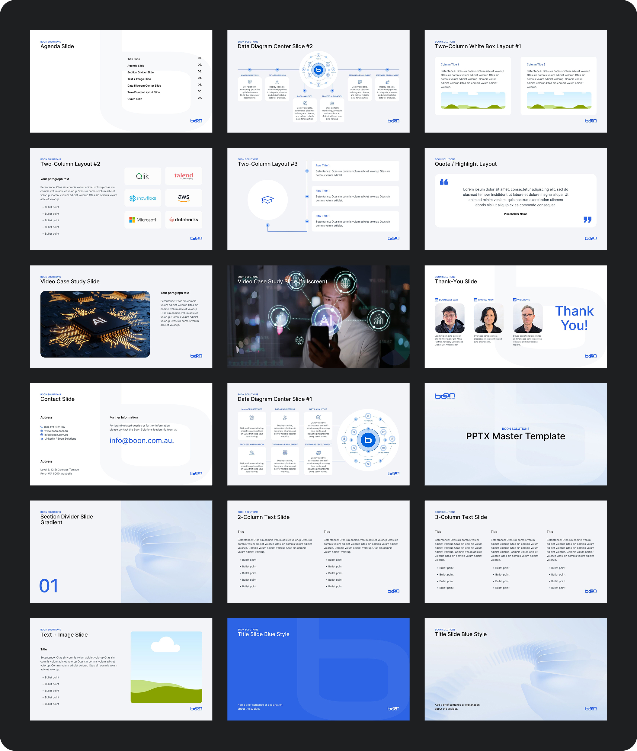
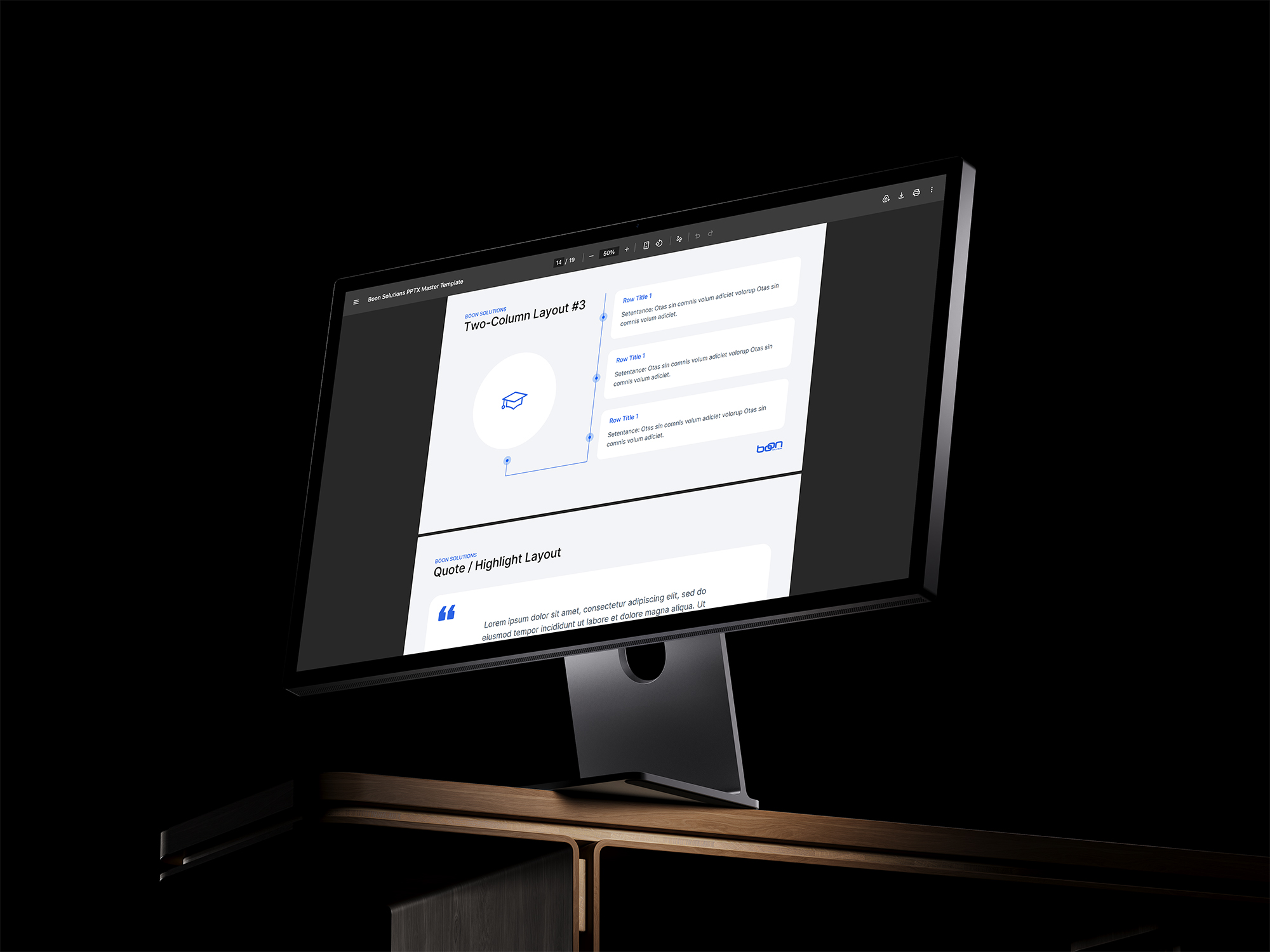
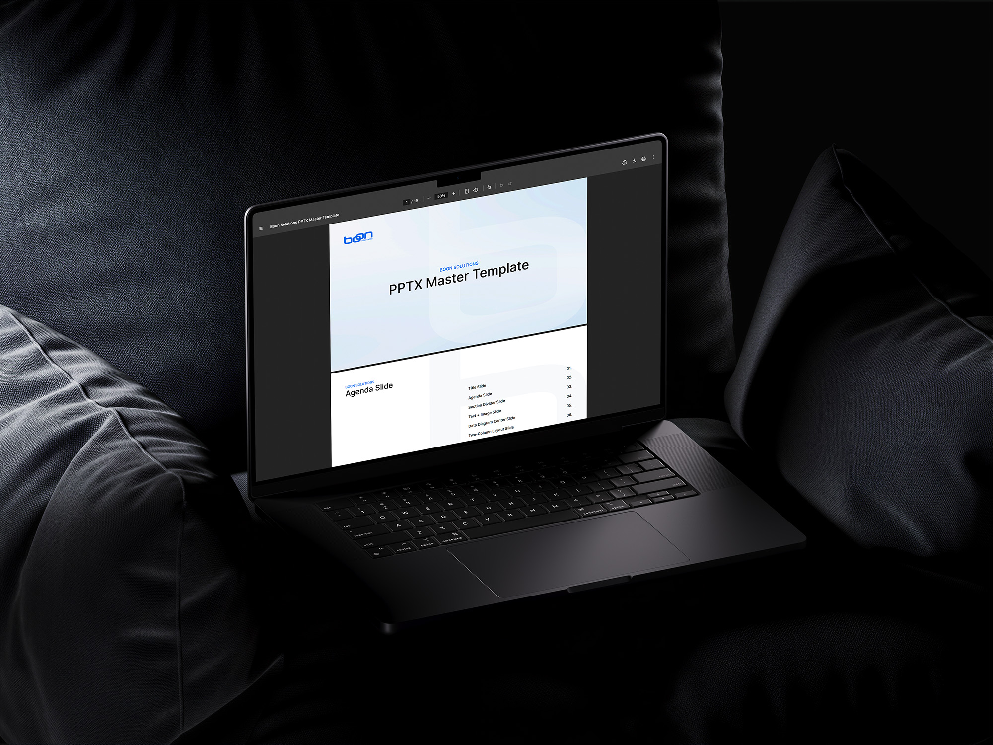
I designed a master deck for proposals, case studies and client conversations, then supplied editable layouts in Canva so the team could build presentations without starting from scratch. Reusable slide patterns keep typography, imagery, diagrams and brand details consistent.

One network,
two clear identities.
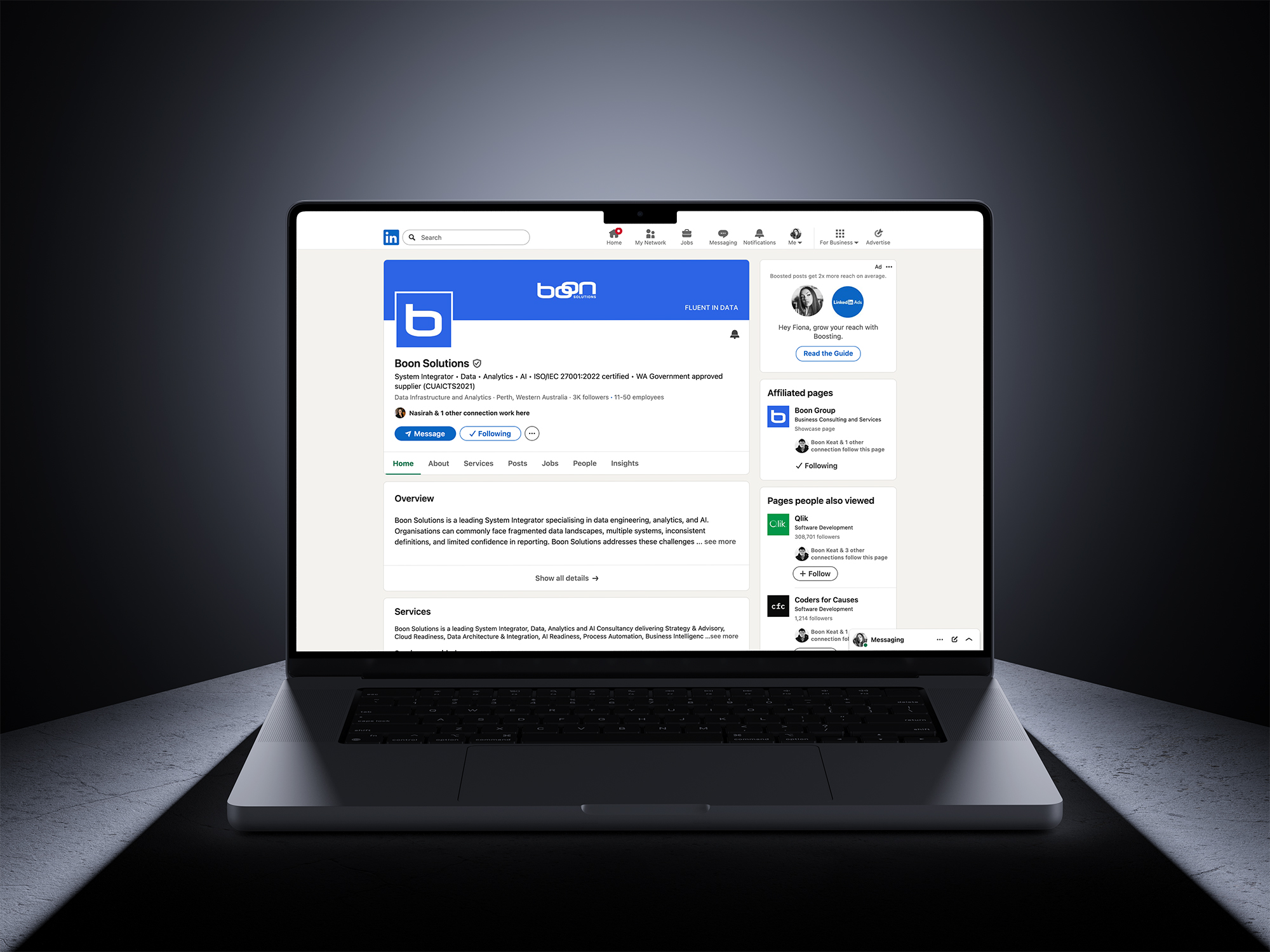
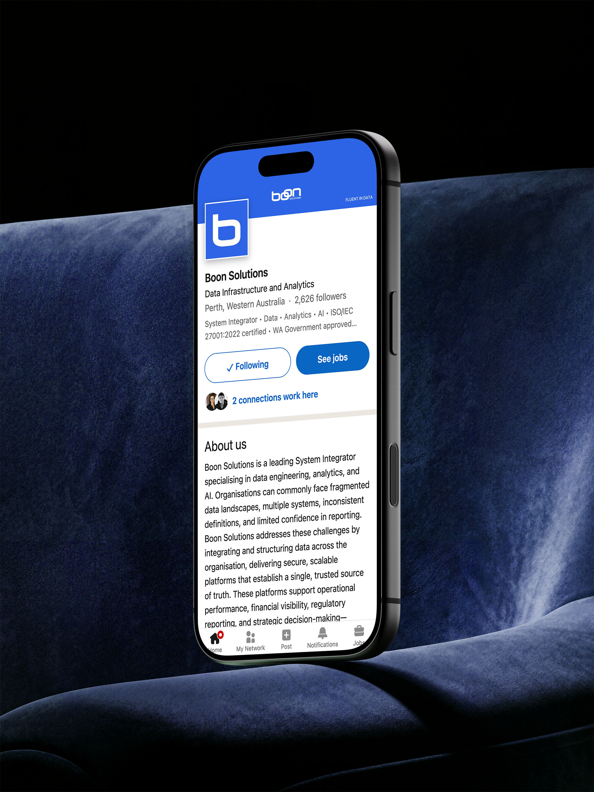
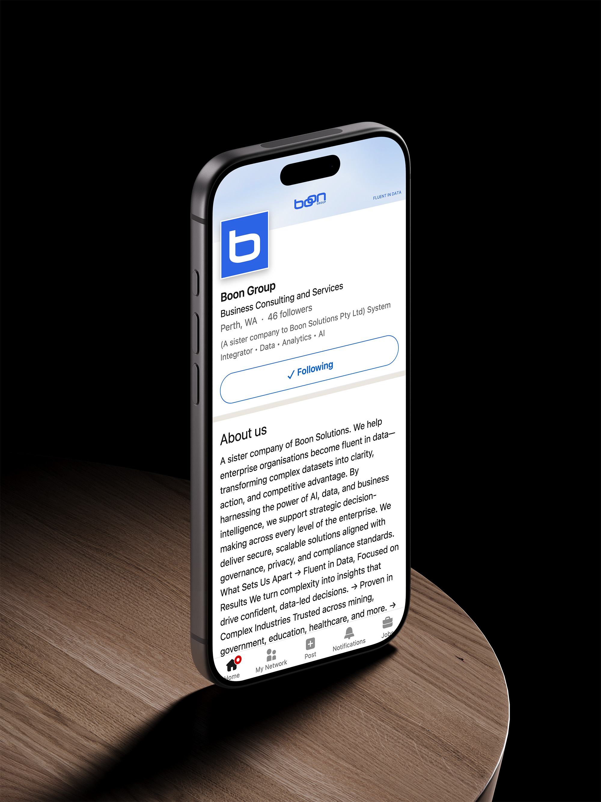
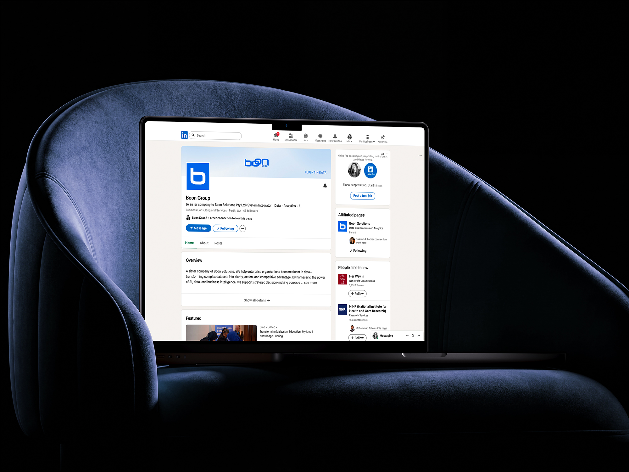
Coordinated banners and profile assets connect Boon Solutions and Boon Group through shared visual cues, while distinct names and lockups make each regional entity clear. The result is a more consistent presence across both company pages.
From conversation
to contact.
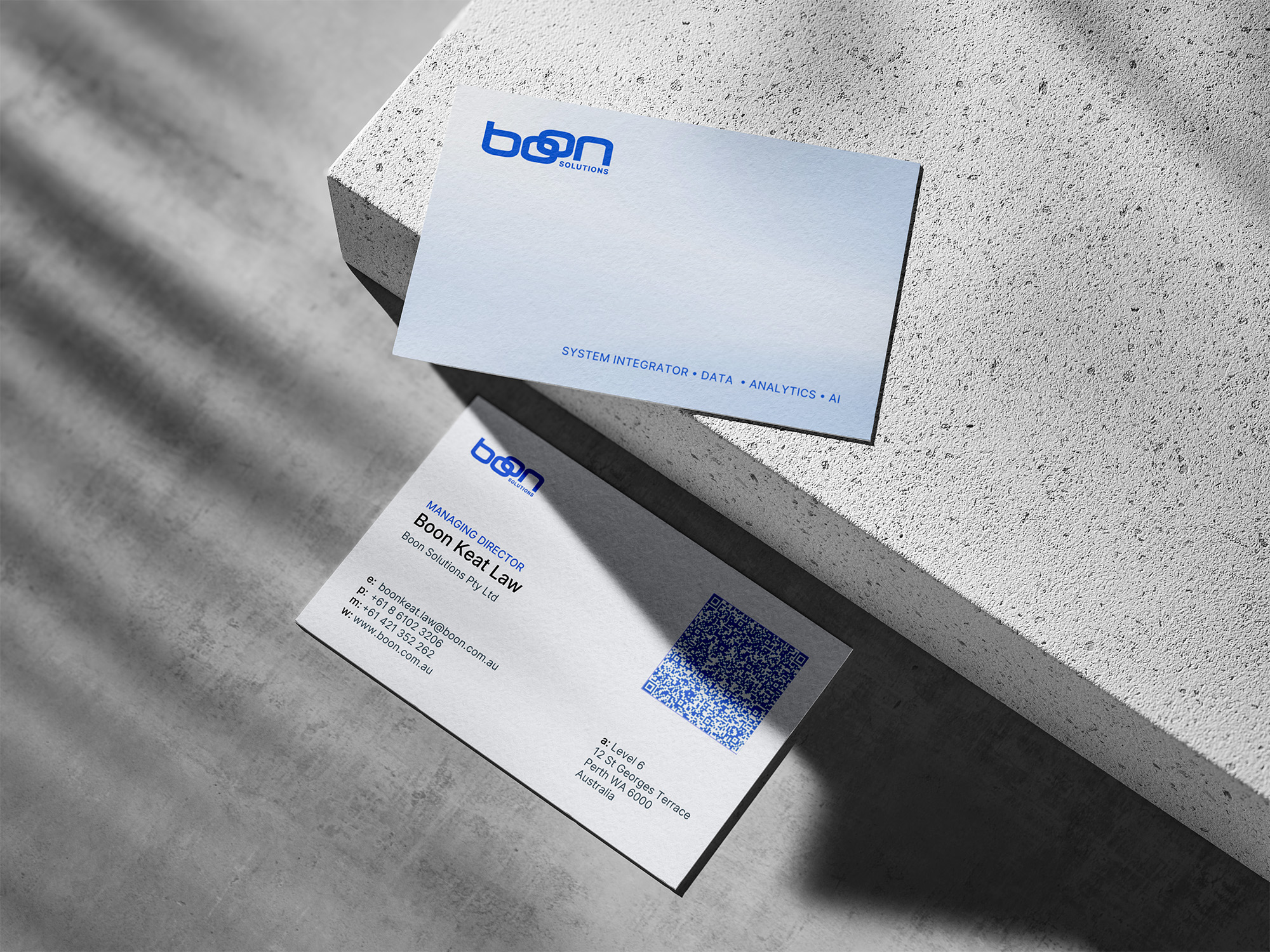
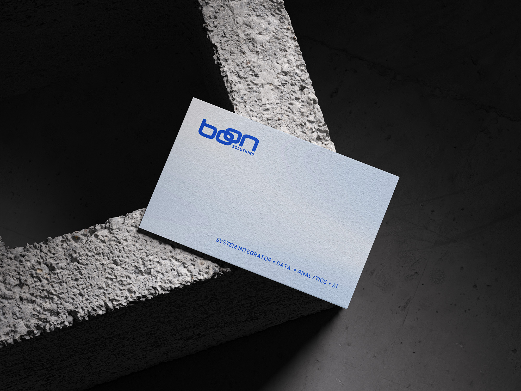
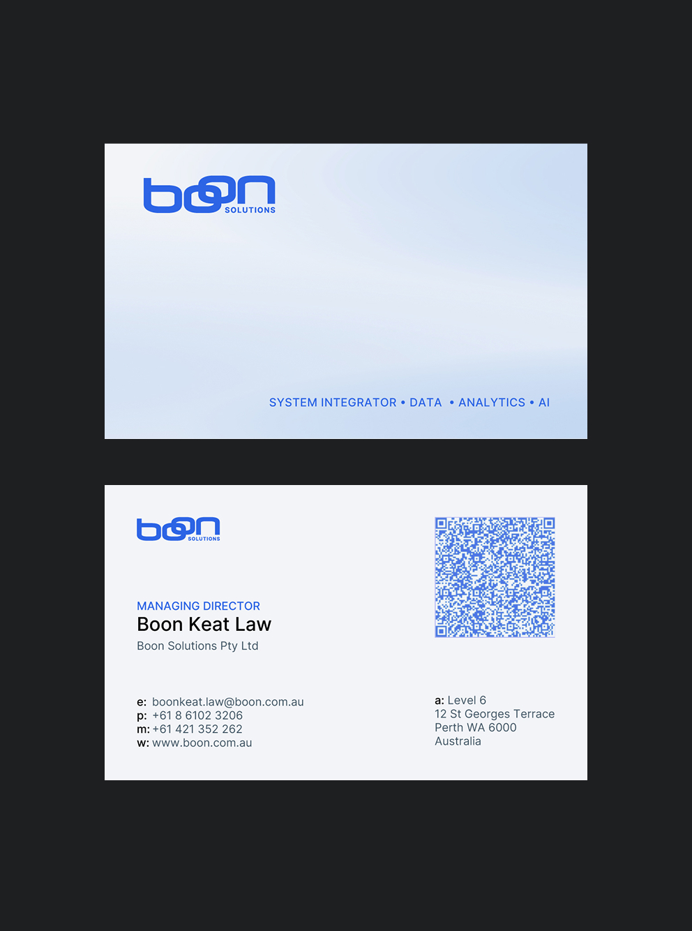
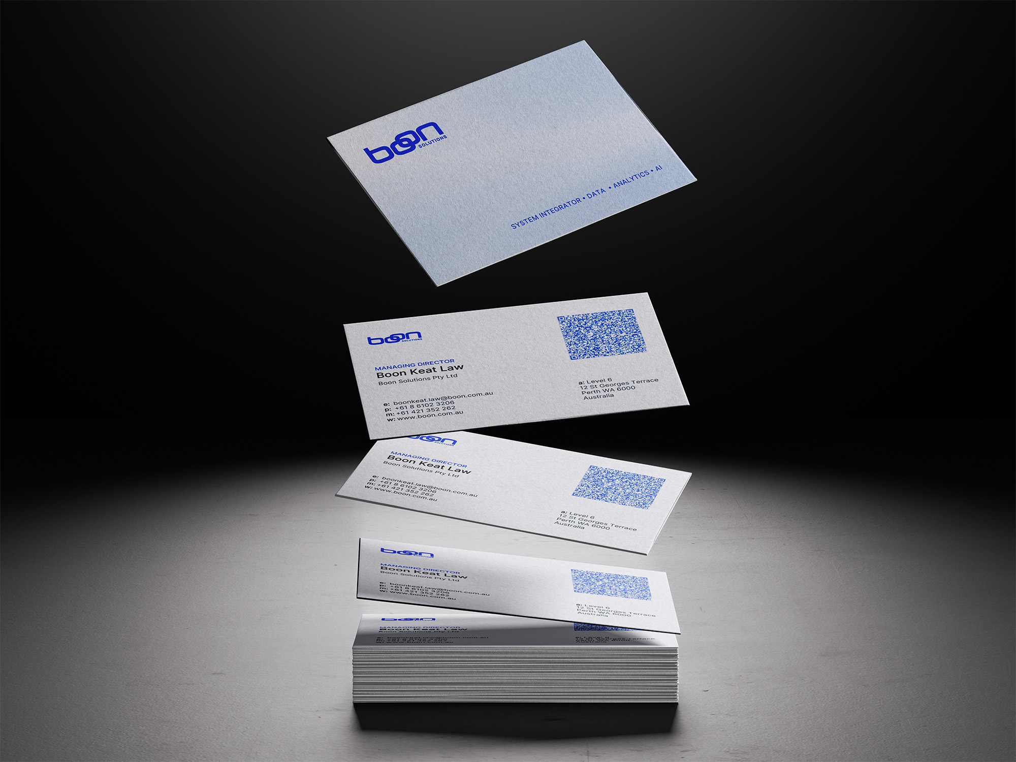
The business card system pairs essential contact details with a scannable QR code, creating a direct path from an in-person introduction to the relevant digital destination. An editable Canva template makes future team cards easier to produce and keep consistent.
Complex expertise,
organised around client needs.
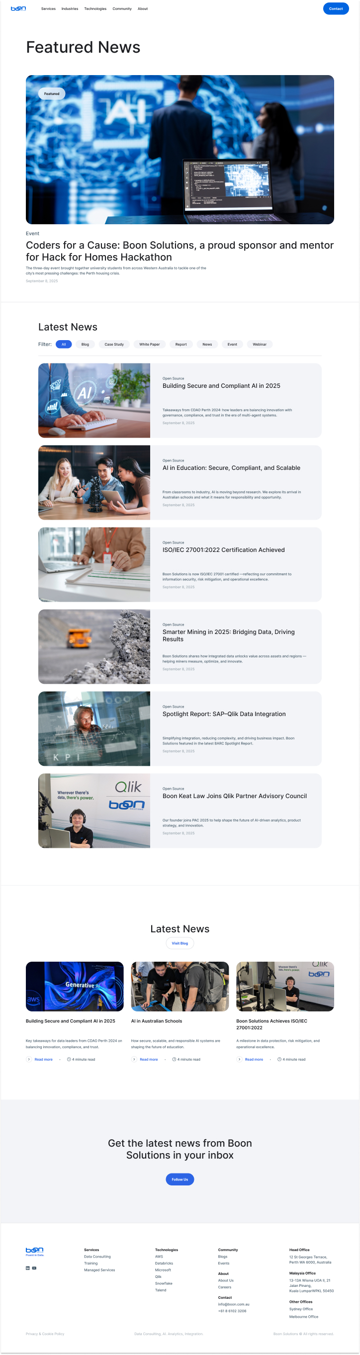
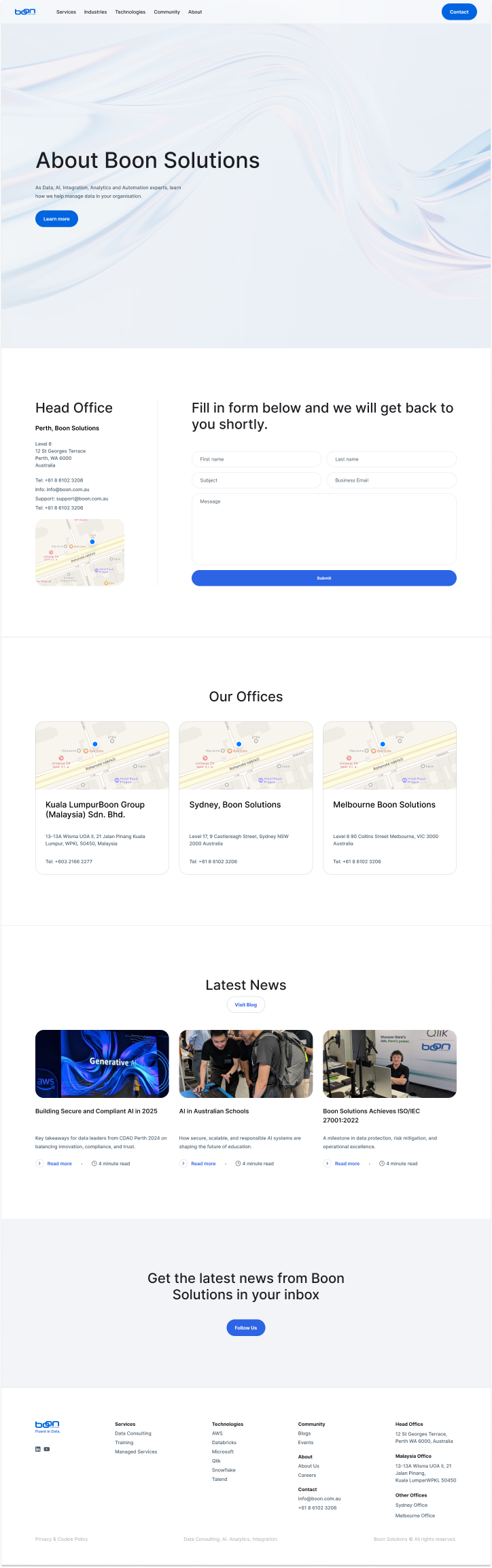
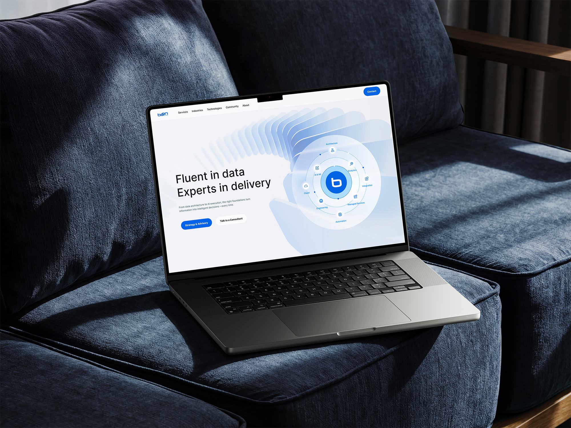
This Figma concept explored a possible future direction for Boon’s website. I designed the structure, visual direction and key user journeys as an interactive prototype, giving the team a tangible idea to review. It remained a design concept and was not developed or launched.






Clear at
every screen size.
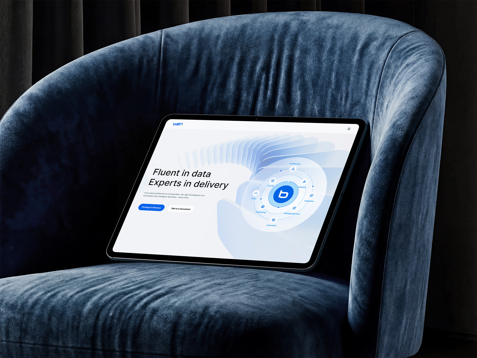
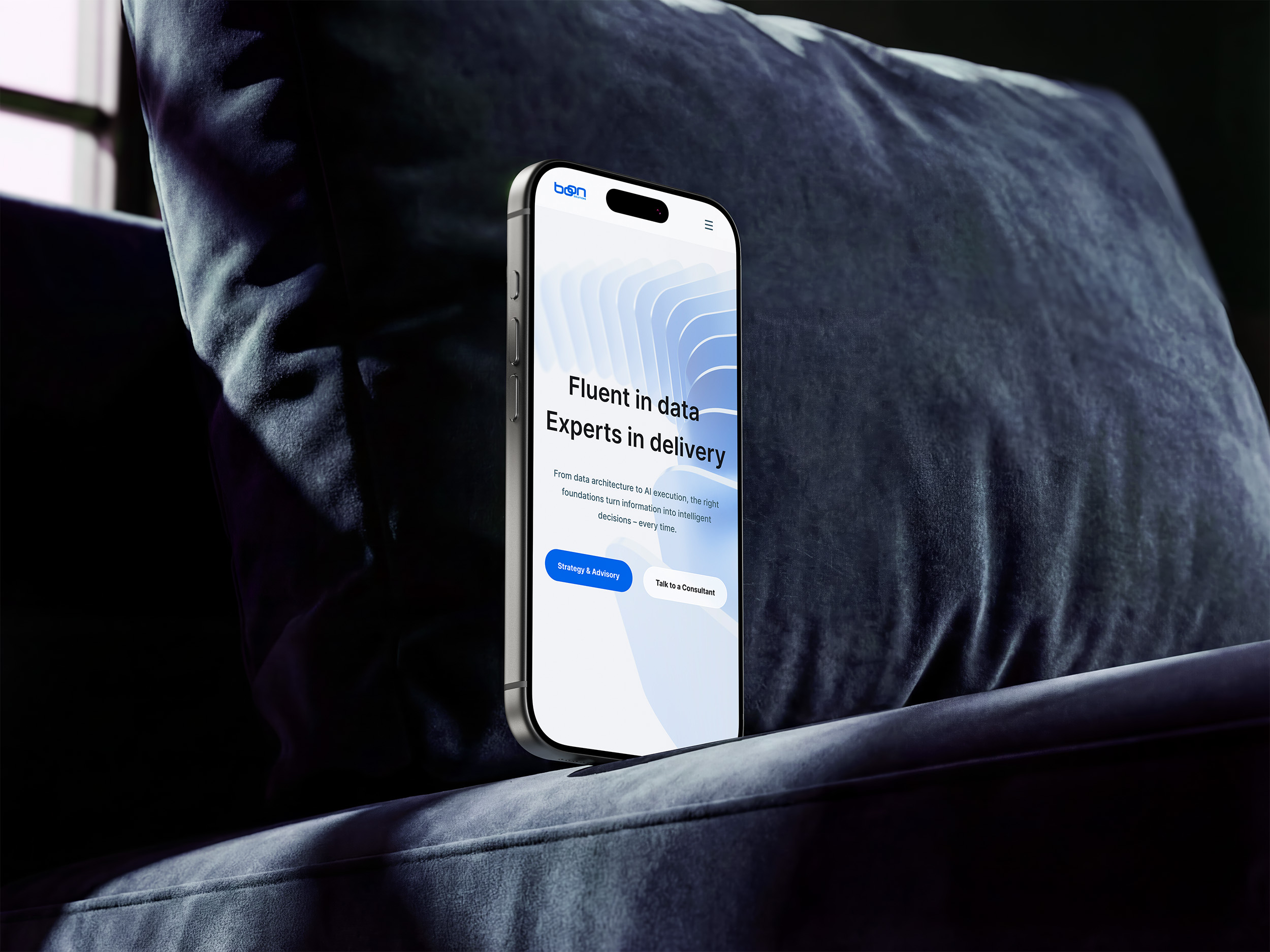
Desktop, tablet and mobile layouts adapt the same hierarchy without losing the detail enterprise buyers need. Flexible grids, simplified navigation and prioritised calls to action keep services, industries and proof easy to scan across devices.
Campaign assets,
ready to adapt.
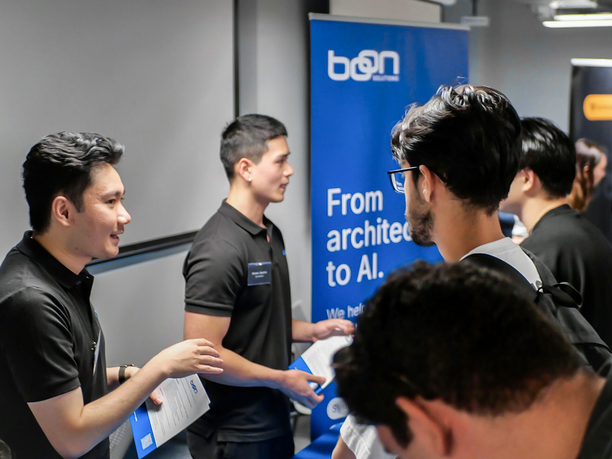
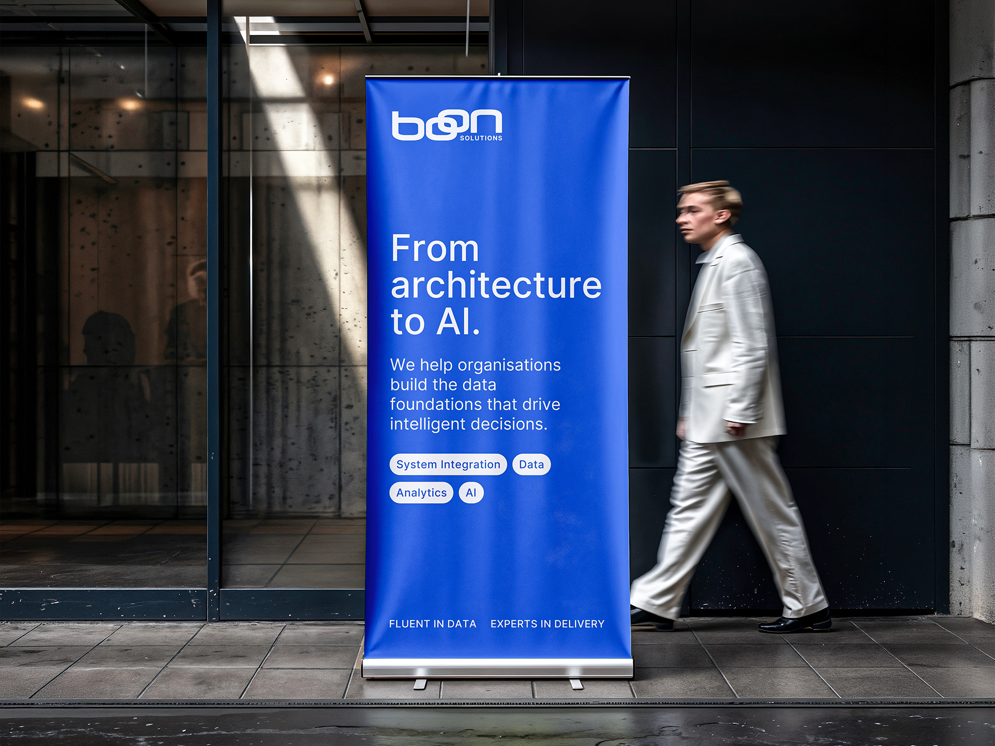
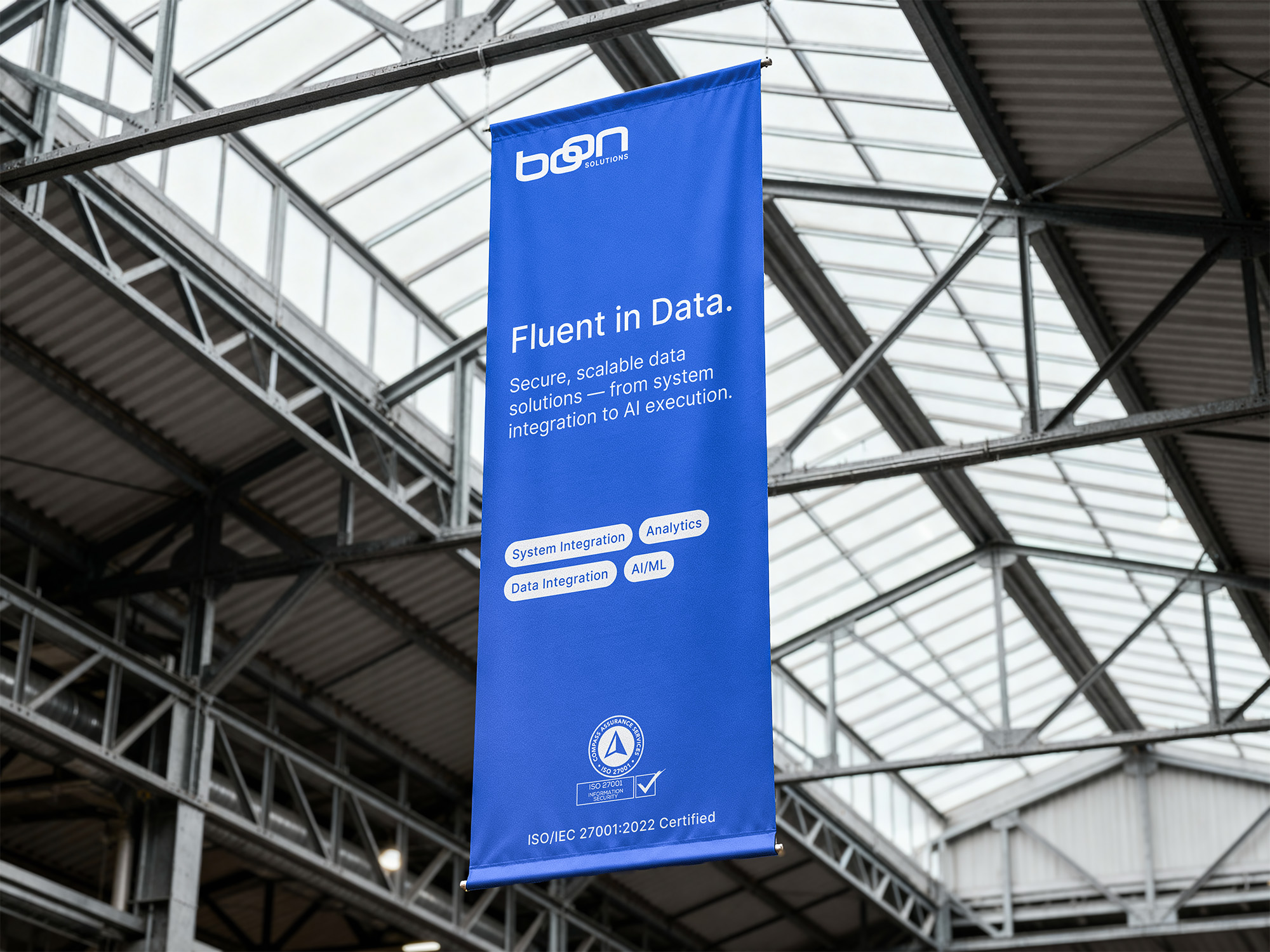
I extended the system into event banners and supplied editable Canva templates for future updates. The team can change messaging and practical details while retaining the hierarchy and recognition of the wider identity.
The outcome,
in Nasirah's words.

I've had the pleasure of working with Fiona on multiple projects and her work has been consistently beautiful, thoughtful, and creative. Beyond her talent, She is an absolute pleasure to work with. A five-star recommendation!