

.svg)
A family story,
brought into one experience.
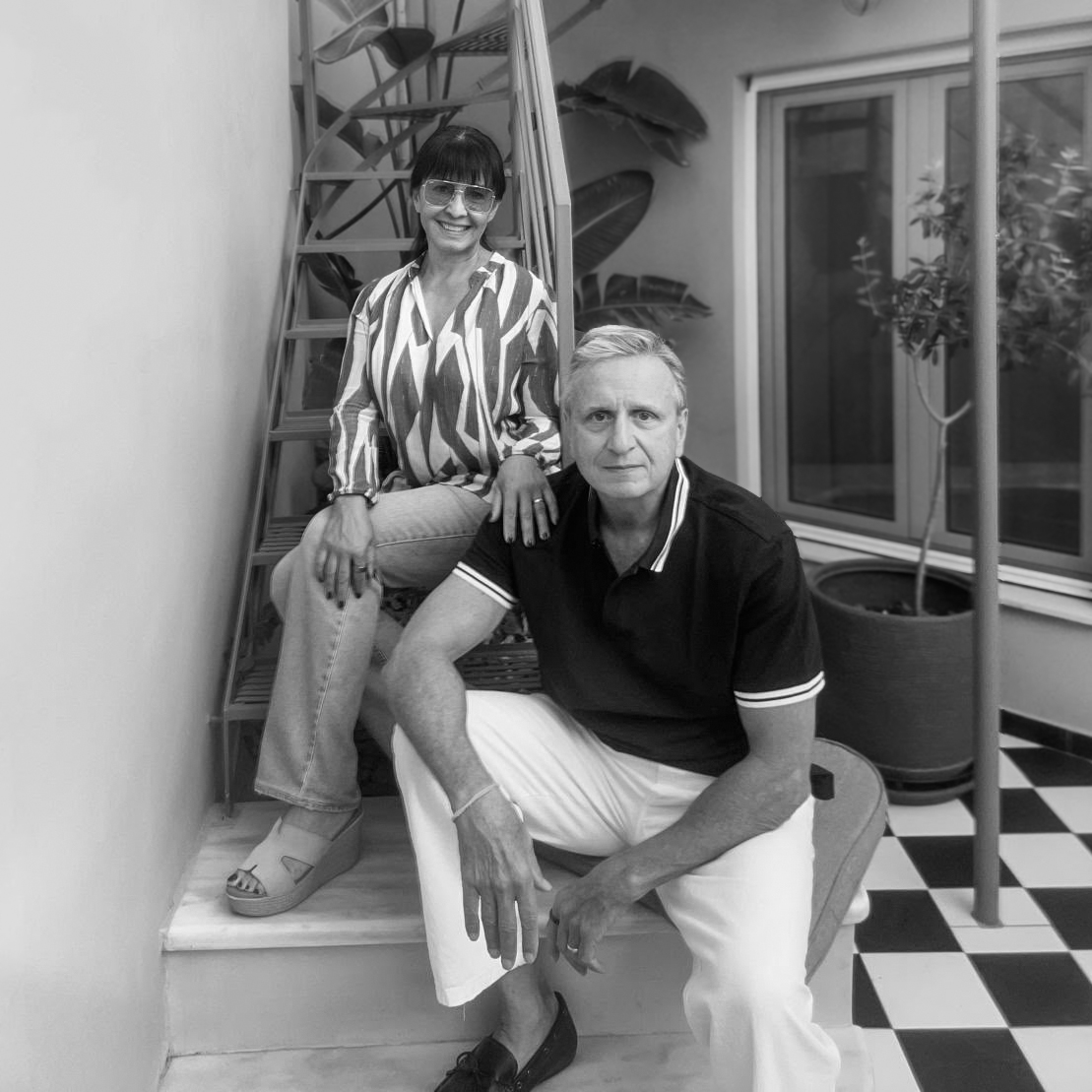
Jeff and Sharona’s approach to hospitality began with Villa Hurmuses on Mykonos in 2002: personal, relaxed and rooted in the feeling of staying in a home rather than a resort.
As that approach expanded into Athens, The Halo Collection needed one clear expression of the same spirit. I brought its story, identity and digital experience together around three connected ideas: guest, home and neighbourhood.
A warm story,
without a clear path.
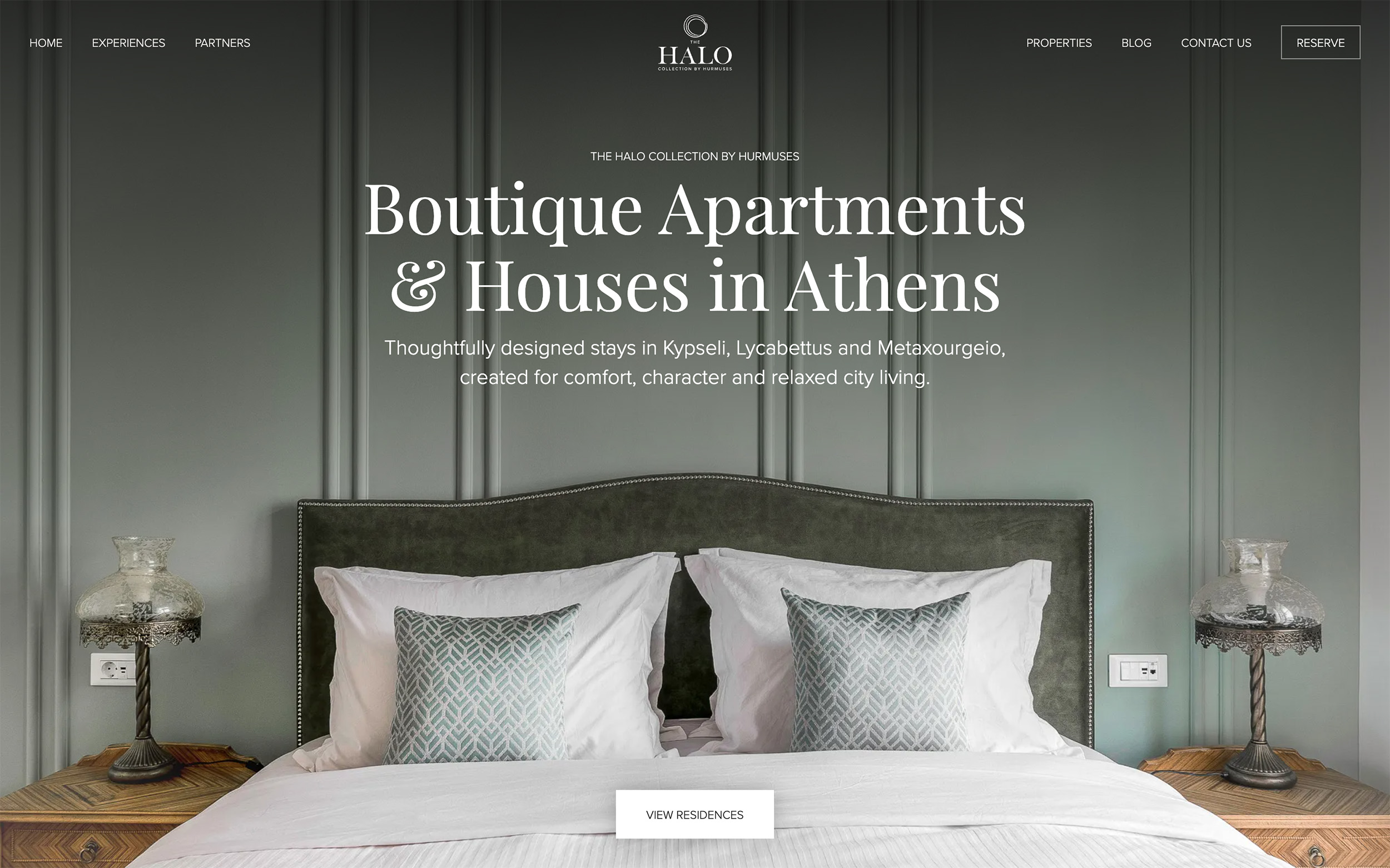
The previous website captured the warmth and character of The Halo Collection. The opportunity was to make each home, its neighbourhood and the differences between stays easier to understand, while creating a clearer path from first visit to enquiry.
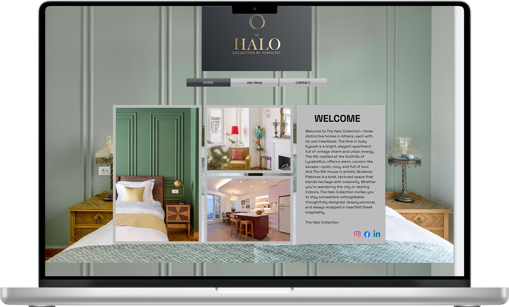
Putting the
guest journey first.
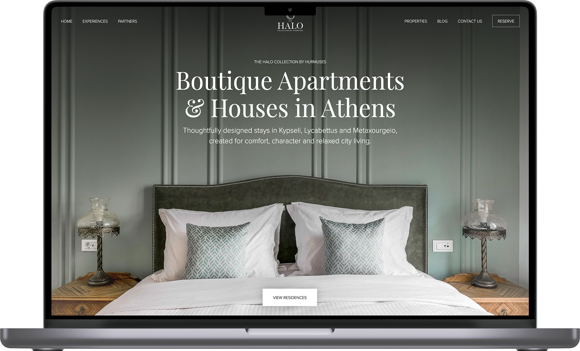
I reorganised the experience around four practical questions: Where can I stay? Which home suits me? What is the neighbourhood like? How do I enquire?
A clearer site structure, more focused copy and stronger page hierarchy connect each guest with the right home and neighbourhood, creating a more confident journey from discovery to enquiry.
An existing idea,
refined into a flexible identity.
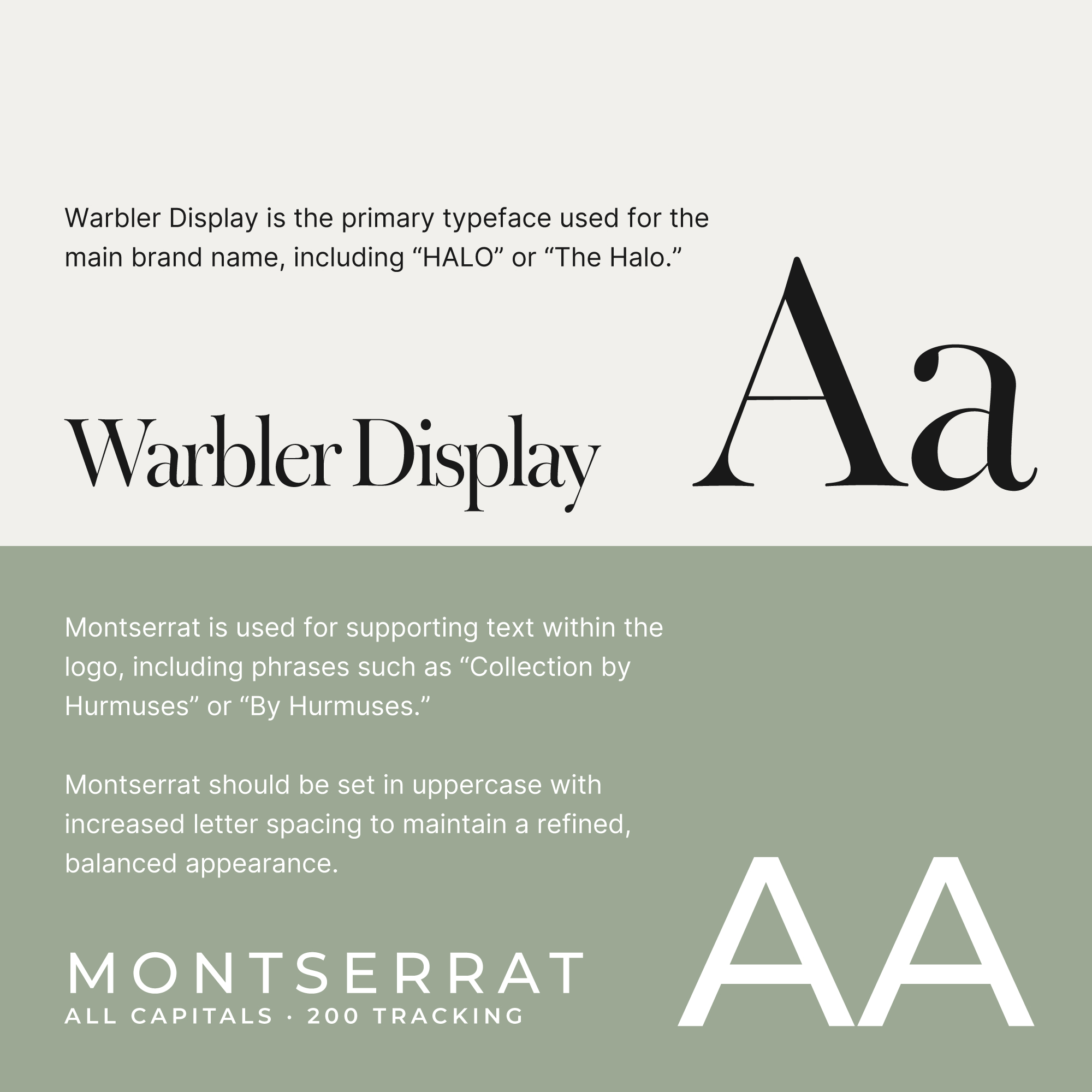
The existing Halo mark was the right place to start. I refined its proportions and expanded it into a flexible suite comprising a primary logo, secondary logo, wordmark and logomark.
A concise brand guide brought the logo system, colour palette and typography together, giving Jeff and Sharona a practical reference for consistent use across web, social and print.


HEX - #FFFFFF
RGB - 255 · 255 · 255
CMYK - 0 · 0 · 0 · 0
HSB - 0° · 0% · 100%
HEX - #F1F0EC
RGB - 241 · 240 · 236
CMYK - 7 · 5 · 8 · 0
HSB - 46° · 1% · 94%
HEX - #9CA894
RGB - 156 · 168 · 148
CMYK - 43 · 24 · 42 · 6
HSB - 94° · 11% · 65%
HEX - #303030
RGB - 48 · 48 · 48
CMYK - 70 · 60 · 56 · 67
HSB - 0° · 0% · 18%
One story, from
founder to brand.
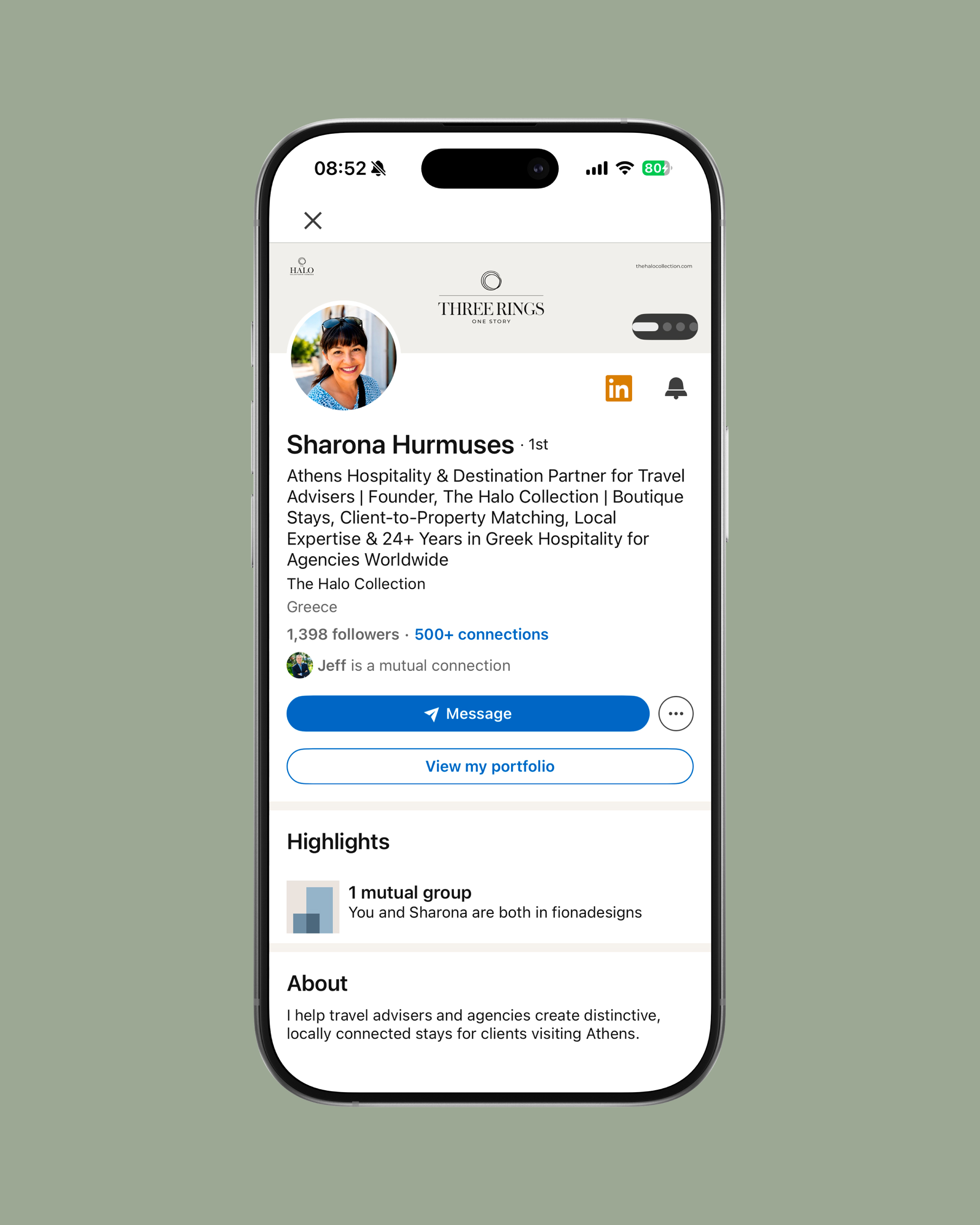
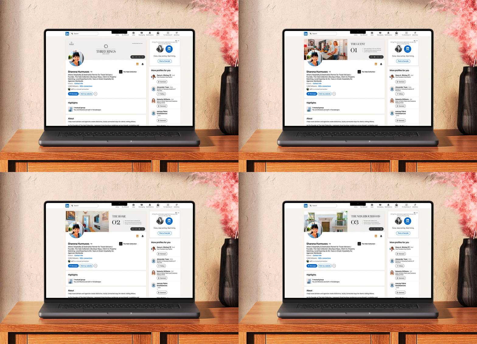
Sharona's personal profile and The Halo Collection company page were brought into one clear system, with sharper positioning and cohesive imagery that make the brand easier to recognise across LinkedIn.


A considered
first impression.
The identity was carried into print through a restrained business card with clear contact details and a scannable QR code, creating an easy bridge from an in-person introduction to the website.


A considered
first impression.
The identity was carried into print through a restrained business card with clear contact details and a scannable QR code, creating an easy bridge from an in-person introduction to the website.

At home on
every screen.
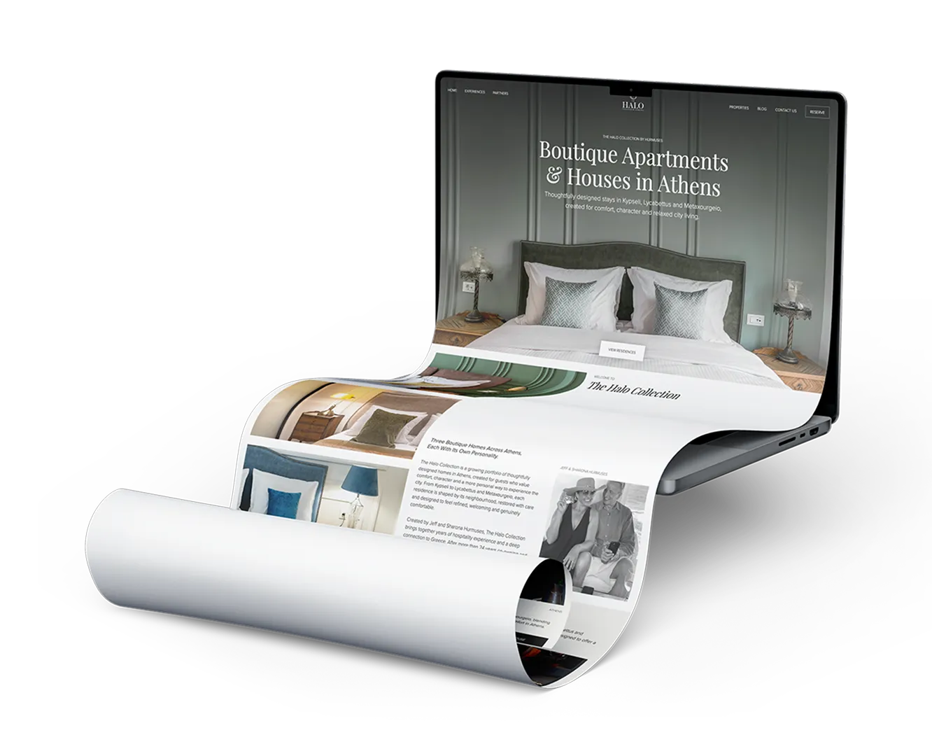
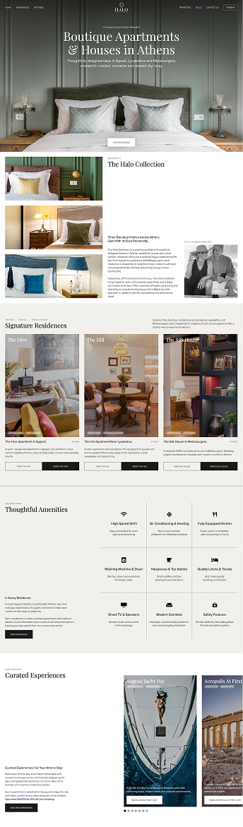
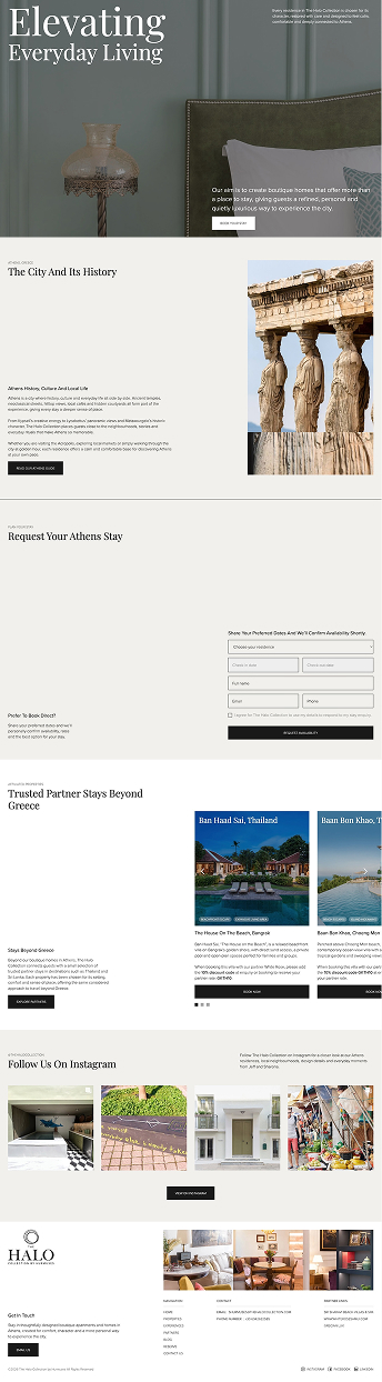
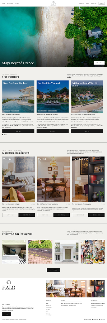
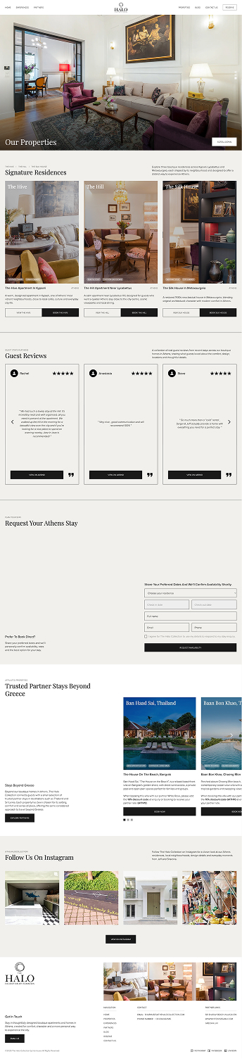
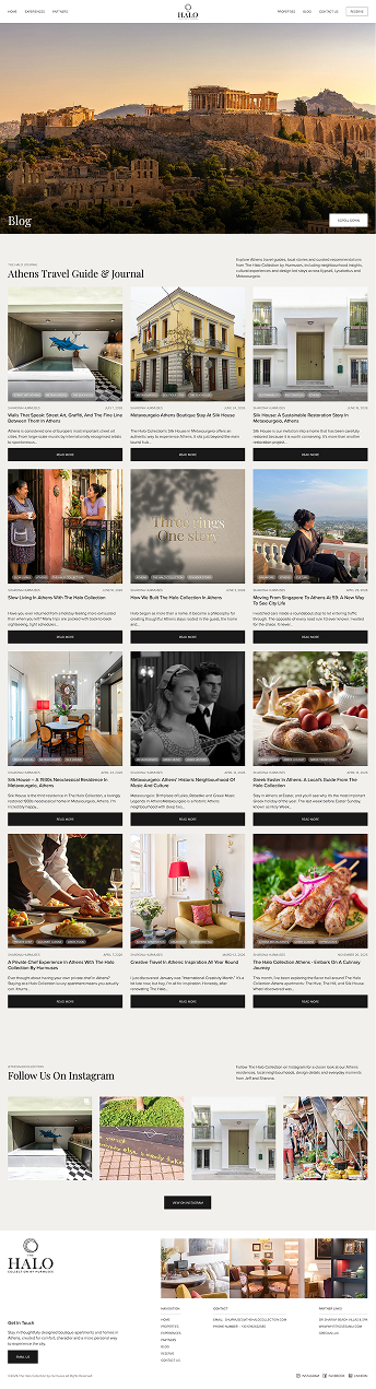
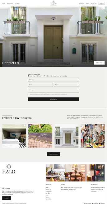
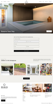
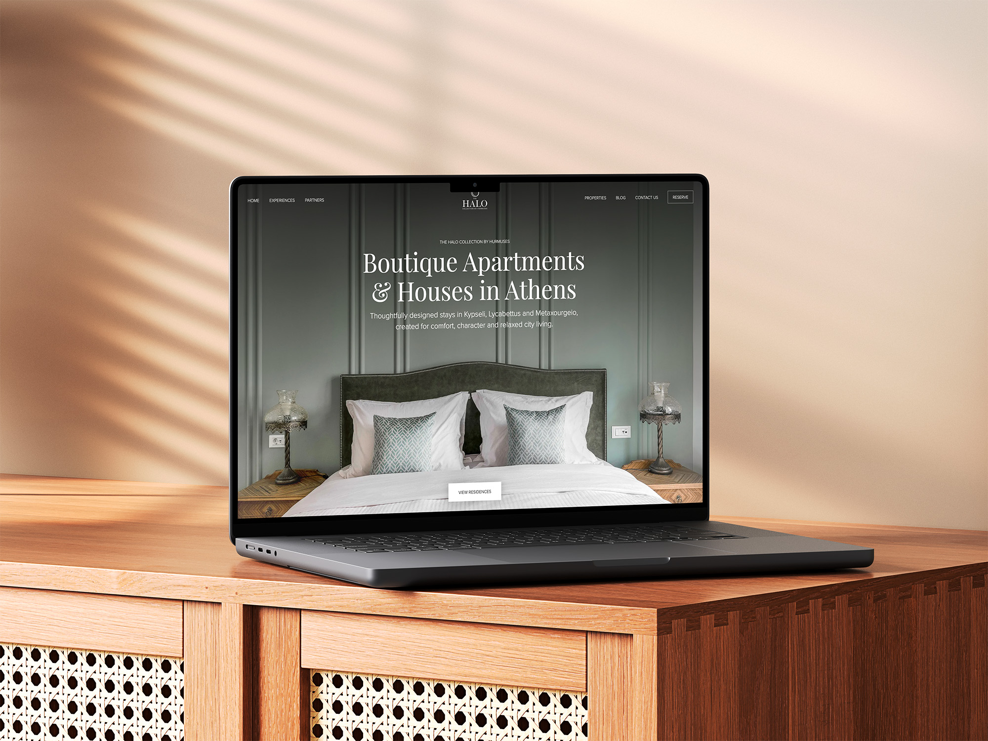
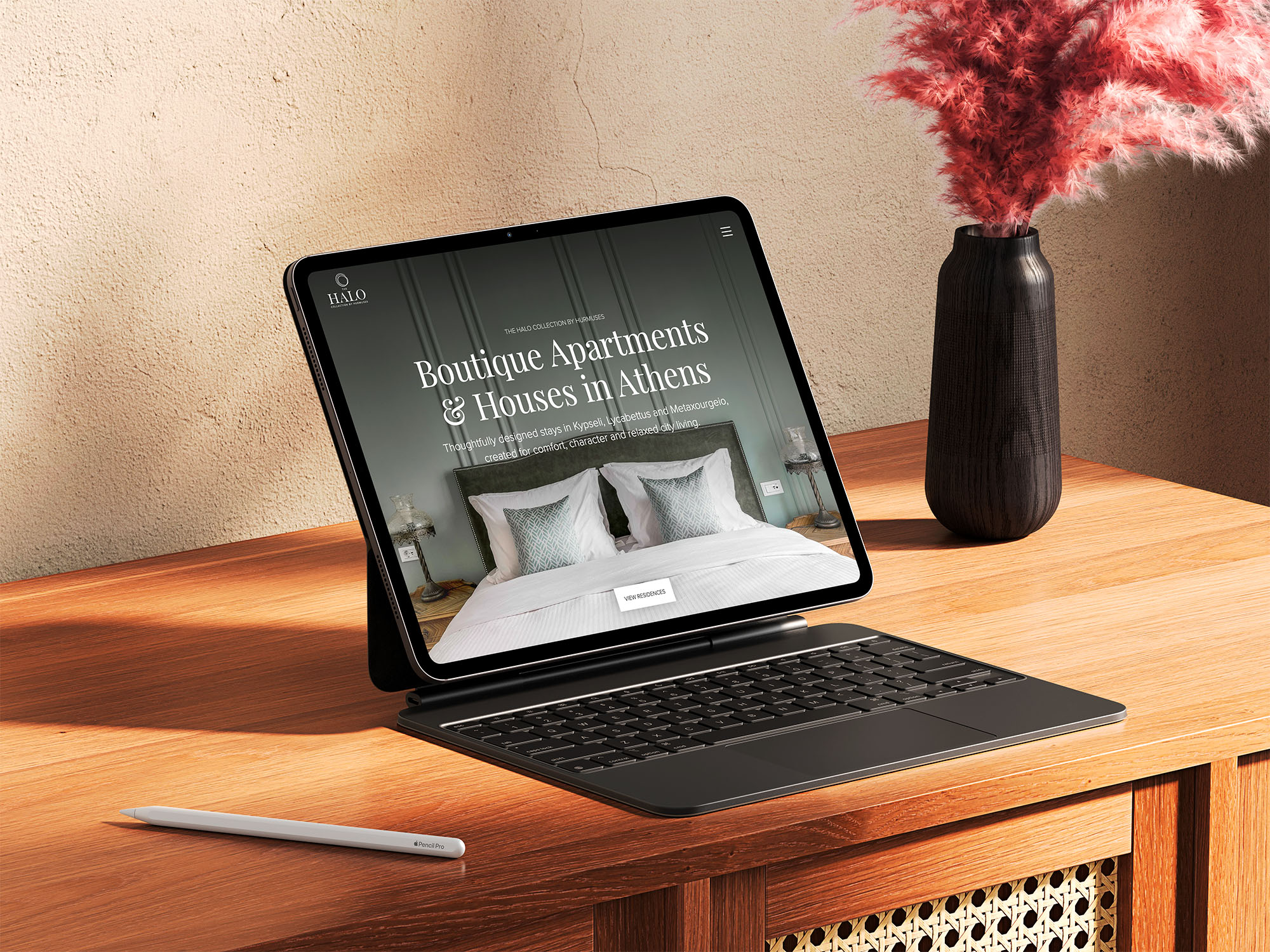
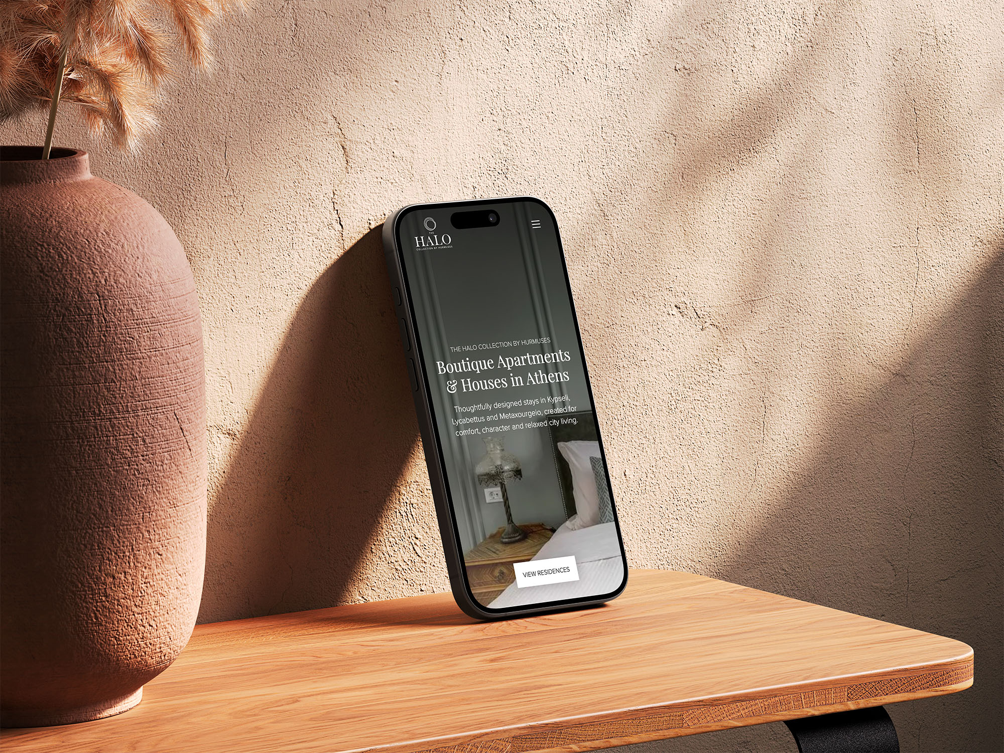
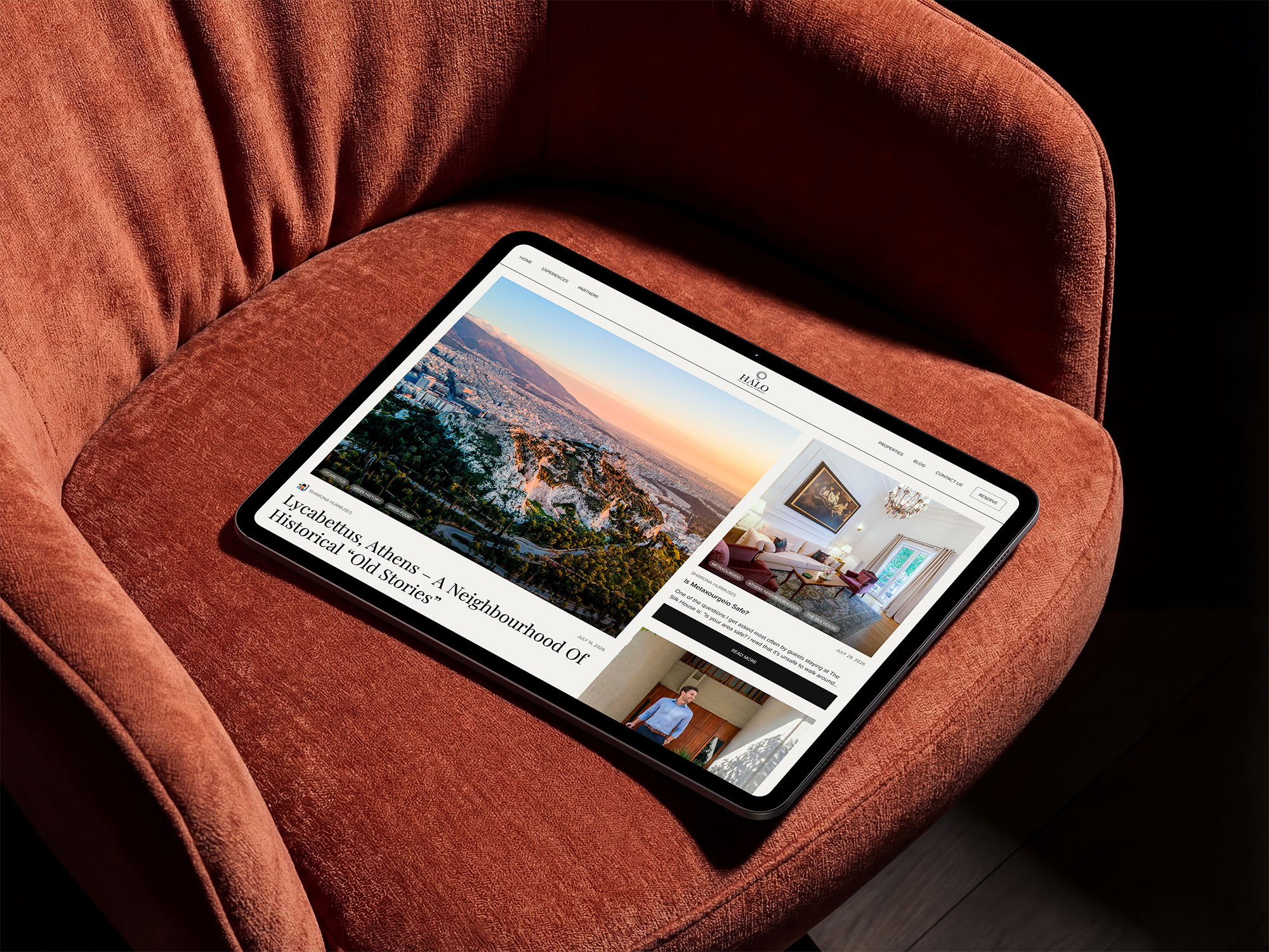
Layouts, typography and interactions were refined for desktop, tablet and mobile, giving guests the same clear path from discovery to enquiry wherever their planning begins.

Built to be found.
Measured to improve.
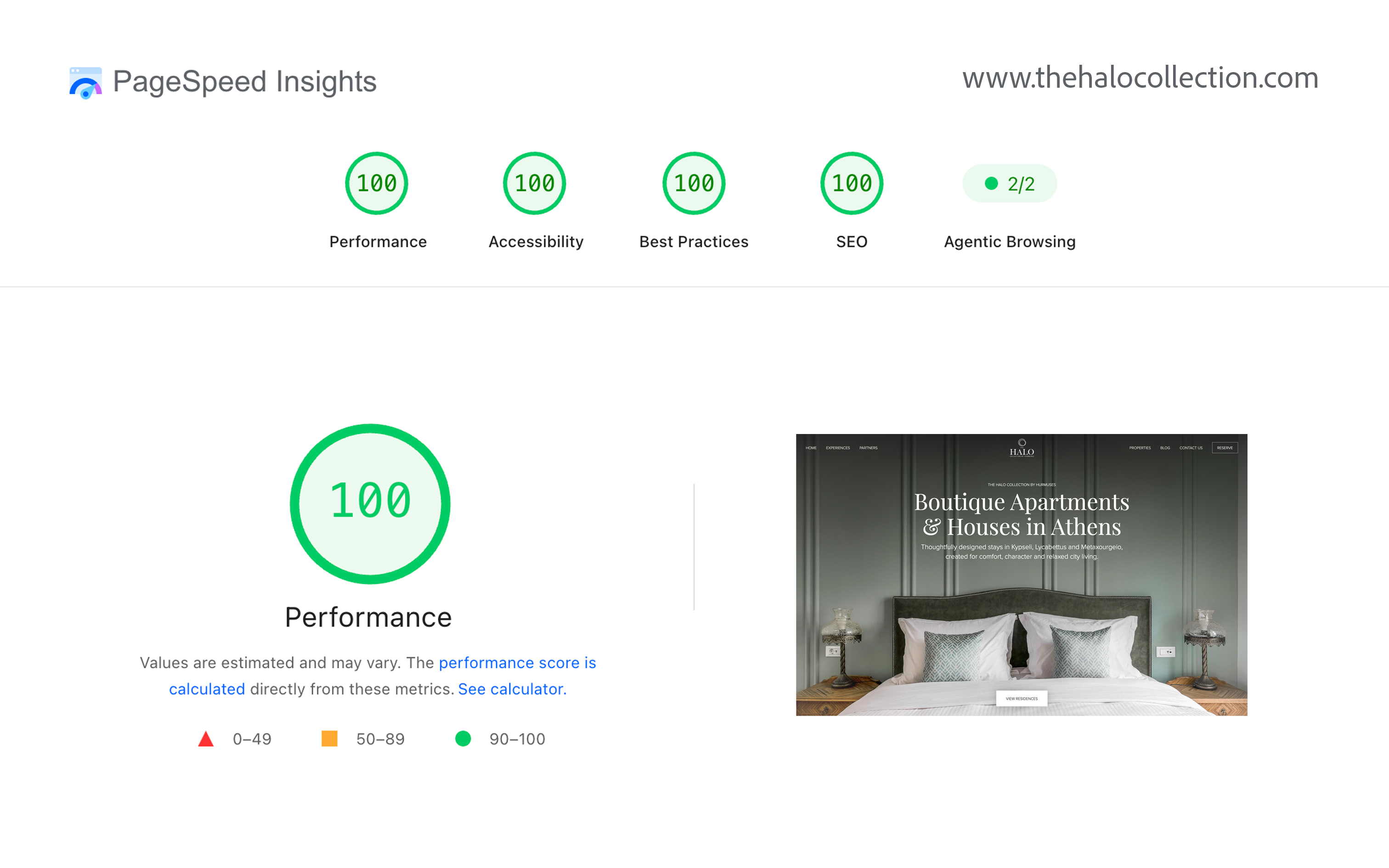
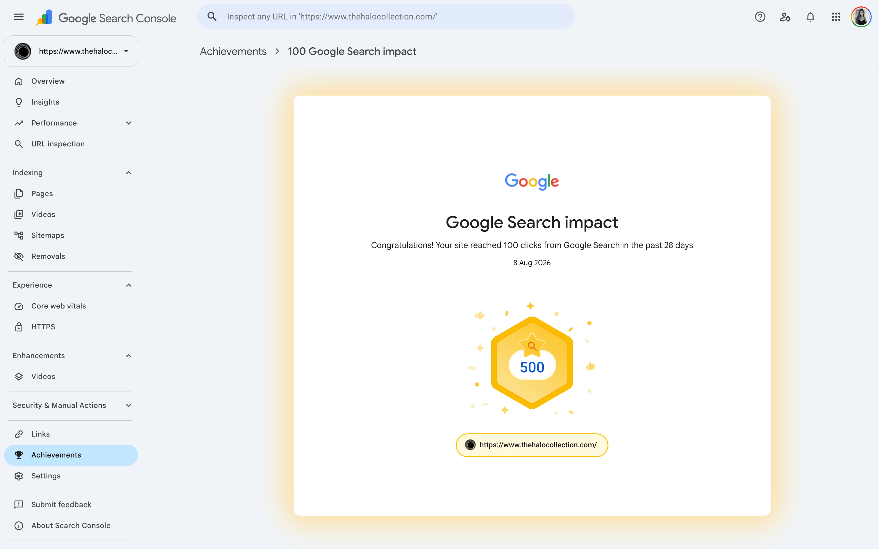
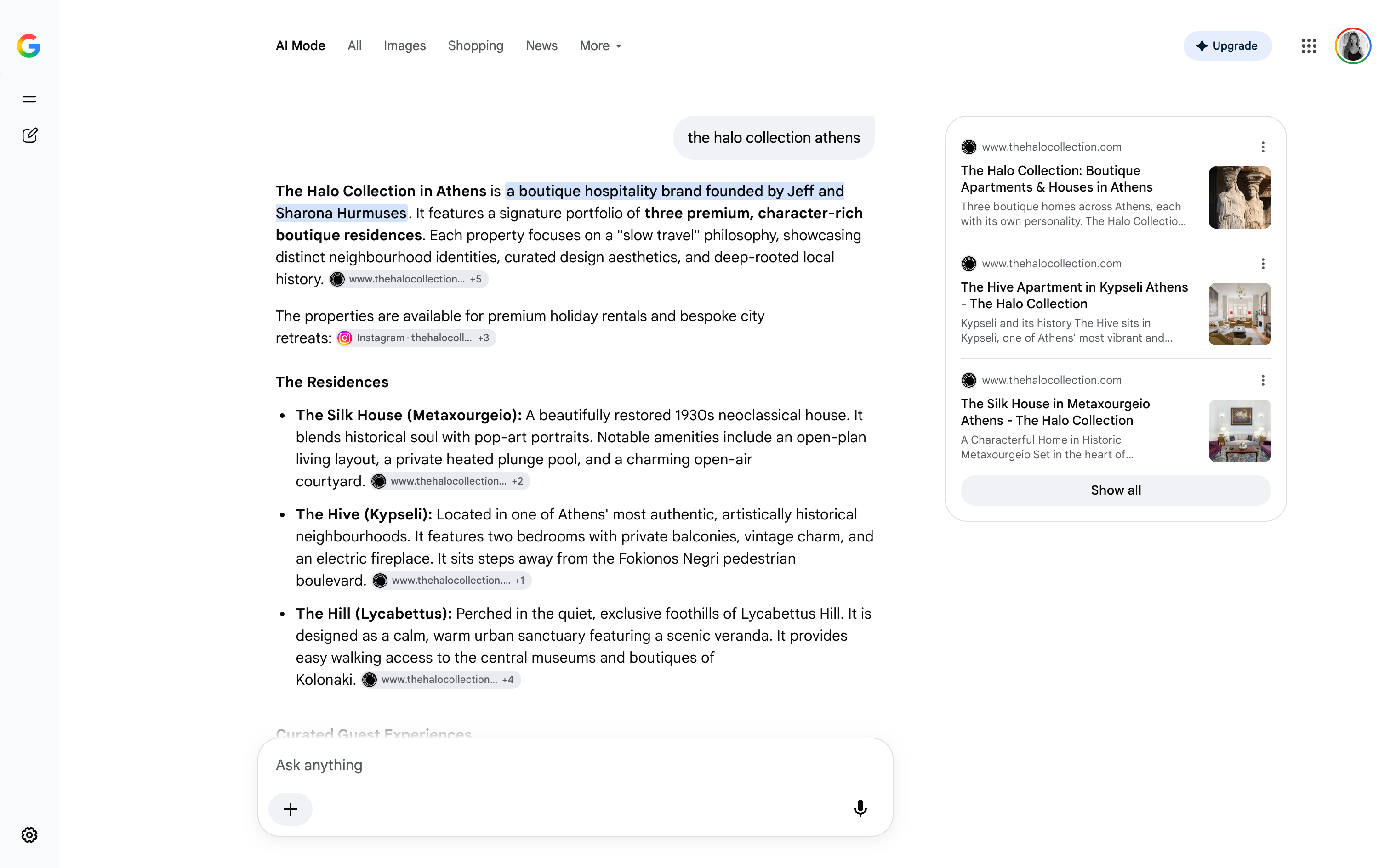
The site launched with technical SEO, fast page performance and analytics in place. Search Console and reporting give the team a clearer view of reach, behaviour and opportunities to improve.
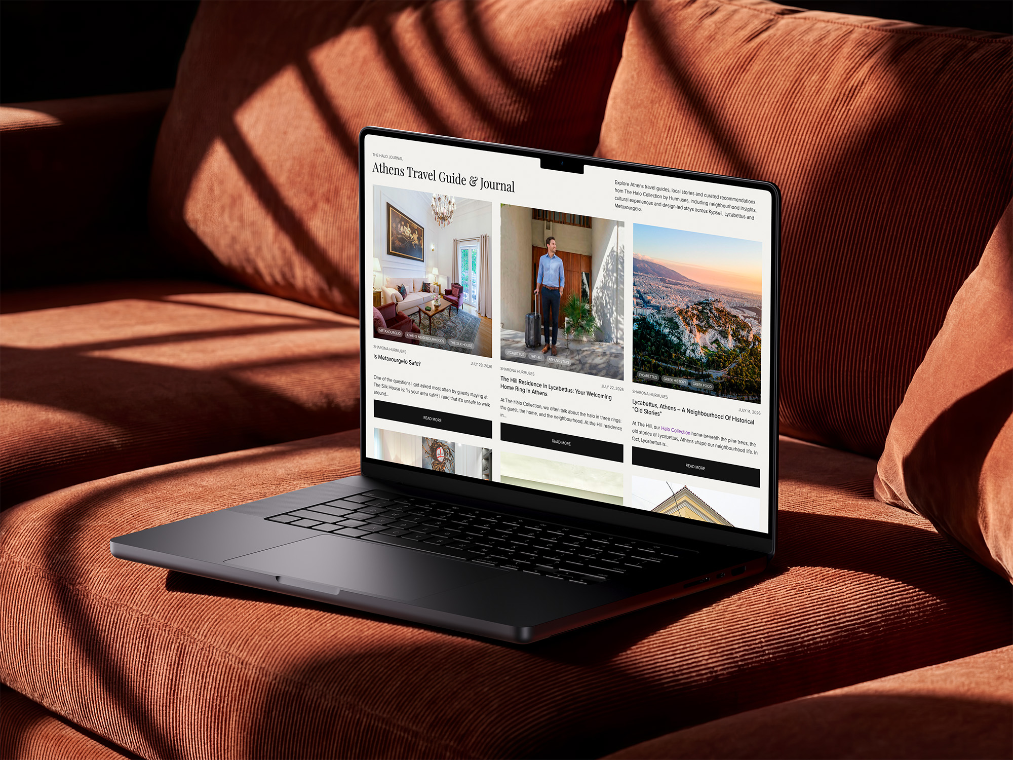
Keeping the Halo
Journal fresh.
I continue to format and publish stories about Athens, its neighbourhoods and the collection, keeping the journal polished, current and aligned with the site's wider content and SEO foundations.
The outcome,
in Sharona's words.

“Working with Fiona on The Halo Collection website was an absolute pleasure. She is professional, highly dedicated, and incredibly responsive. She works hard, pays attention to detail, and genuinely cares about delivering a result that reflects your vision.”